
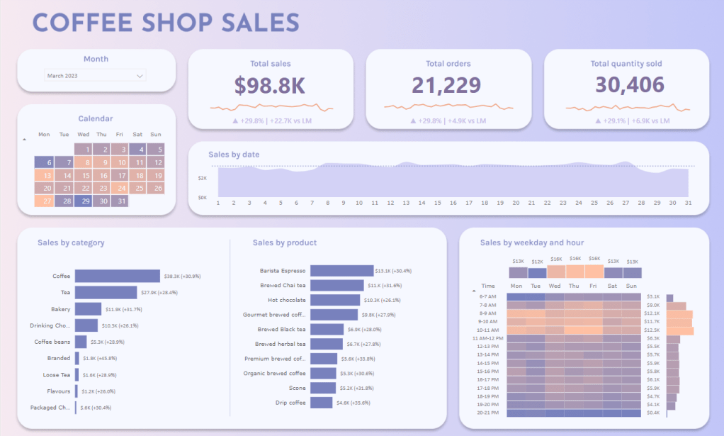
I just finished this Power BI dashboard redesign and I was very satisfied with the result. So I wanted to share it and add some words on the working process.
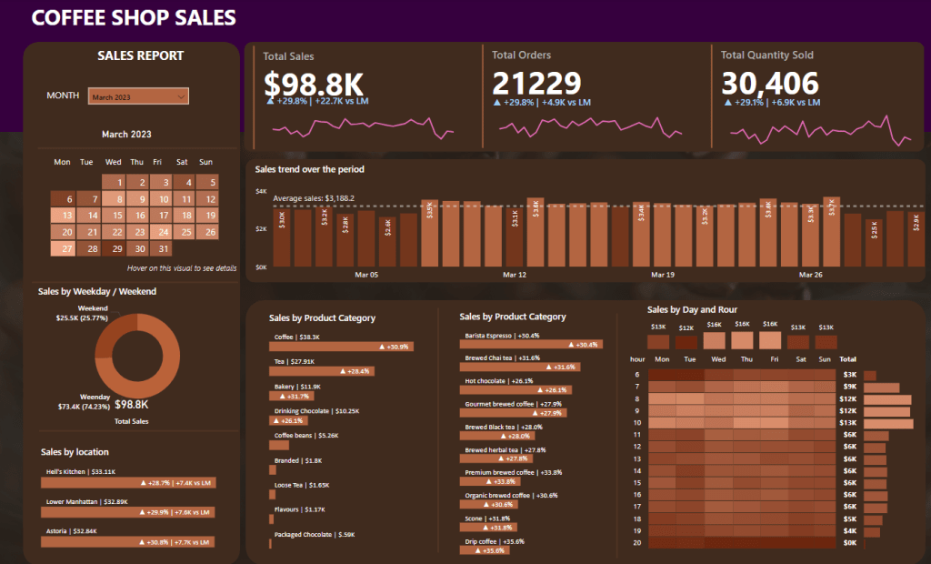
My starting point was Data Tutorials’ coffee shop sales dashboard (from this tutorial):
Overall design and style
Recently, I’ve seen a lot of talented BI people (see Bas Dohmen) making use creating a more app-like dashboard design inspired by neumorphism. I made use of a gradient background, and hovering boxes with rounded corners + drop shadows to encapsulate the chart elements.
Elements and layout
The dashboard contains a lot of information and I wanted to keep it a bit lighter. I opted to remove the Sales by location bar chart (which didn’t provide much insight) and the Sales by weekday/weekend donut chart (you can get fairly similar insights from the heatmap).
Putting multiple elements in the same container is a great way to tell the viewer that these elements are somehow connected (see the gestalt principle of enclosure). I felt the need to use this technique a little more sparingly than in the original design. I opted for putting all elements in their own designated containers, except for the Sales by Product Category and Sales by Product bar charts, which are functionally hierarchical and would benefit from being tied together.
I could write a lot more about the process, but it was mere a first step at getting more reps in dashboard design. The only way to learn how to make truly state-of-the-art designs is to get a lot of repetitions, and I hope to do a lot more writing as I build stuff from the ground up.

Leave a comment